bal·ance/ˈbaləns/ Noun: An even distribution of weight enabling someone or something to remain upright and steady: “she lost her balance before falling”.
In scrapbook layouts, balance can help a reader feel comfortable while viewing your page, and (for the most part) that is the effect you want. You’d like to draw the viewer in, and keep their interest as they spend time examining the pieces of your layout. You would like them to read your words and look at the pictures so they can understand the story you are trying to tell. If the page is off-balance, the viewer may want to move on more quickly. If you are going to spend the time on a page, why not, then, make it pleasing to the viewer? Balance can help.
NOTE: I stated above that for the most part you would like the viewer to be comfortable while viewing a scrapbook layout. However, if the story you are trying to convey is meant to make the viewer feel a tad uncomfortable, than maybe having a page that is a bit unbalanced is what you would like to do.
Some of the things that you can pay attention to while trying to balance a scrapbook page, are the following:
- Size
- Color
- Placement
For instance, if you have a page with a lot of pictures and you place them all at the top of a page, the layout can feel top heavy and not as appealing. As in real life, where gravity affects things, the denser, heavier objects should tend to be low on the horizon. If you saw a small item, say a bird, on the ground and a heavy dump truck above it, that would feel un-natural and you probably would not be as happy viewing that scenario- and the bird probably would not be too happy either ![]() . It is the same with scrapbook layouts. Generally, placing the larger items on the bottom of the page will feel a bit more natural to the viewer than if they were reversed.
. It is the same with scrapbook layouts. Generally, placing the larger items on the bottom of the page will feel a bit more natural to the viewer than if they were reversed.
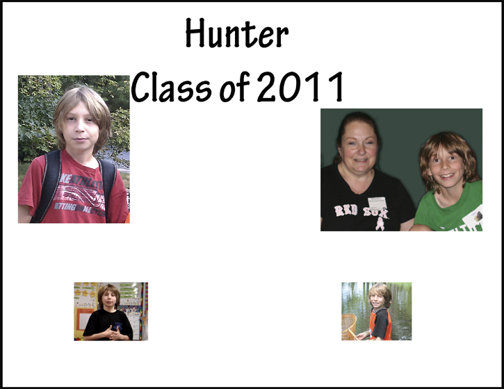
Here is an example of a layout with smaller pictures on the bottom, and larger pictures up top with heavy black writing up high as well. There are a lot of other things wrong with this layout ![]() , but for this post we are just concentrating on balance:
, but for this post we are just concentrating on balance:
If all we do is move the small pictures up and the larger ones down, it can still feel a bit un-balanced because the images on the bottom are now not balanced left to right:

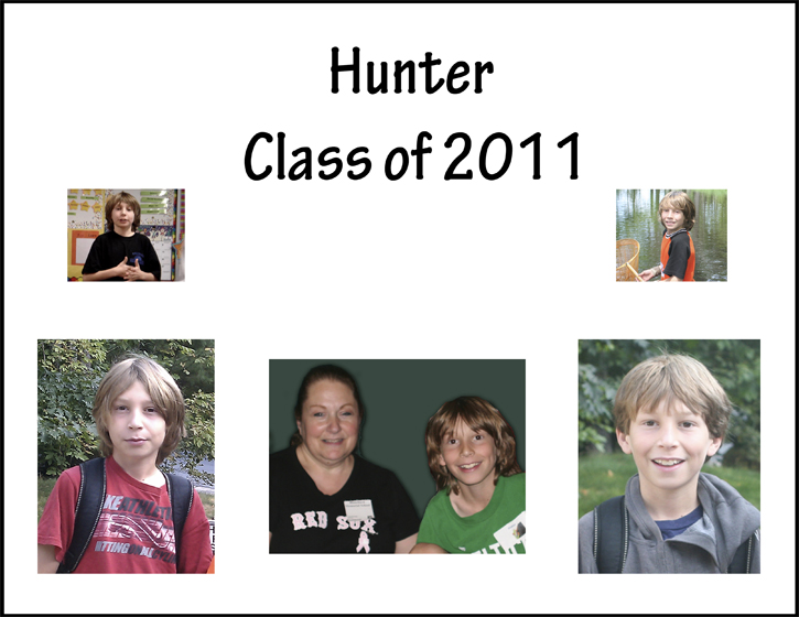
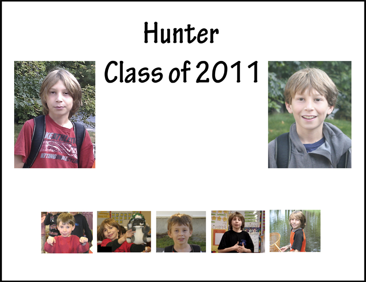
Now see what happens with the larger, heavier pictures on the bottom, and the addition of a third picture that adds balance horizontally on that bottom tier. This is a more balanced composition, and is more comfortable to view:
Now, it is not always the case that the large pictures must go on the bottom. Adding a number of smaller pictures together in a group can add weight, and that group can then help balance out larger pictures on top as is shown in this example:
Color can also help with balance, with darker colors acting as the ballast. The dark colors will feel heavier and can help to add balance. In this example layout, the heavy black at the bottom of the layout, is balancing the image at the top which, while smaller, is denser in color and could potentially feel out of balance in its position way at the top. However, the black at the bottom pulls you back down to earth, so to speak, and so the composition works.

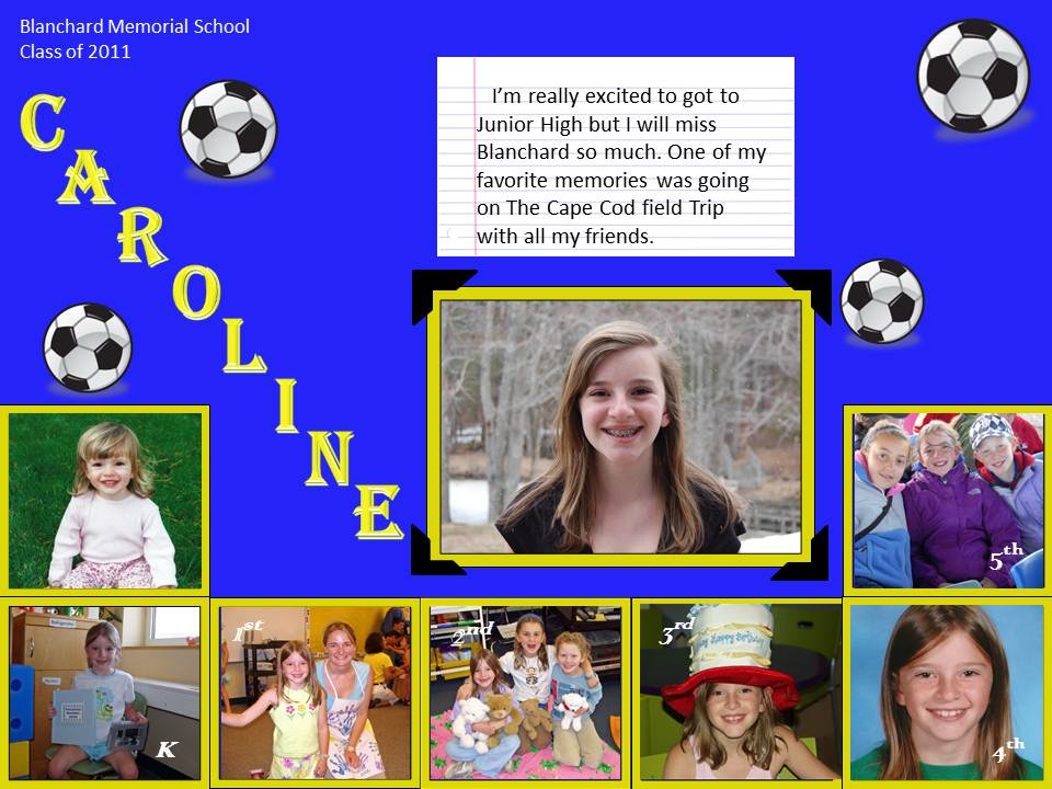
My final example was created by a 12 year old! She has never taken a scrapbooking class, yet intuitively she created a well balanced layout. The smaller pictures grouped together frame and balance the larger picture. There are a number of other great things about this page, including the fact that she used the school colors, included her name, the school’s name, an indication of her favorite sport, as well as a timeline as she grew up through the elementary school. My favorite part is her name. She draws you in as you read her name, right to the focal point of the page- her current picture. This is a great layout, and I am so glad Caroline shared it with me ![]() .
.